2026 DesignSafari & Web
WWDC26 · 10 min · Design / Safari & Web
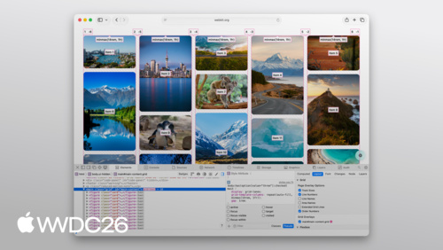
Rediscover the HTML select element
Learn how to unlock full control of styling select menus on the web. The HTML select element is getting a major upgrade with a new CSS appearance value, and new pseudo-elements. Discover how the select options can contain rich content with new possibilities in HTML. Build selects that match your design system, while keeping all the accessibility and robustness of the default element.
Watch at developer.apple.com ↗Chapters
Code shown on screen · 18 snippets
Basic markup
<label for="sort-select">Sort by</label>
<select id="sort-select">
    <option>Newest</option>
    <option>Oldest</option>
</select>
Native form control
select {

}
appearance: base-select
body {
    font-family: Gill Sans, sans-serif;
}

select {
    appearance: base-select;
}
Style the select button
select {
    appearance: base-select;
    background-color: var(--green-10);
    border: none;
    padding: 0.6em 1em;
}
Picker icon
select:open {
    background-color: var(--green-100);
    color: white;
}
Picker icon open state
select:open {
    background-color: var(--green-100);
    color: white;
}

select:open::picker-icon {
    content: url(icons/arrow-white.svg);
}
Picker select
::picker(select) {

}
Picker select spacing
::picker(select) {
    appearance: base-select;
    padding: 4px;
    margin-top: 0.5em;
}
Picker select border and shadow
::picker(select) {
    appearance: base-select;
    padding: 4px;
    margin-top: 0.5em;
    border: 1px solid rgba(0,0,0,0.2);
    border-radius: 9px;
    box-shadow: 0 4px 20px rgba(0,0,0,0.2);
}
Custom option styles
option:checked {
    font-weight: 600;
}

option:not(:checked) {
    color: #777;
}
Picker option checkmark
option::checkmark {
    content: url(checkmark.svg);
    width: 0.65em;
}
Images in option
<option value="flower">
    <img src="flowers.svg" alt="">
    <span class="text">Flowers</span>
</option>
Custom option highlight
option::checkmark {
    display: none;
}

option:checked {
    background: #00857e;
    color: white;
}
Grid layout in drop downs
::picker(select) {
    display: grid;
    grid-template:
       1fr 1fr / 1fr 1fr 1fr;
    gap: 1rem;
}
Select with image options
<select>
    <option value="anywhere">
        <img src="icons/all.svg" alt="">
        <span class="text">Everything</span>
    </option>
    <option value="buildings">
        <img src="icons/buildings.svg" alt="">
        <span class="text">Buildings</span>
    </option>
    <option value="flowers">
        <img src="icons/flower.svg" alt="">
        <span class="text">Flowers</span>
    </option>

</select>
Select menu
<select>


    <option>    </option>
    <option>    </option>
    <option>    </option>
</select>
Select menu button
<select>
    <button>

    </button>
    <option>    </option>
    <option>    </option>
    <option>    </option>
</select>
SelectedContent Element
<select>
    <button>
        <selectedcontent></selectedcontent>
    </button>
    <option>     </option>
    <option>     </option>
    <option>     </option>
</select>
Resources
Related sessions
-
 10 min
 -
 17 min