2024 App ServicesSwiftUI & UI Frameworks
WWDC24 · 13 min · App Services / SwiftUI & UI Frameworks
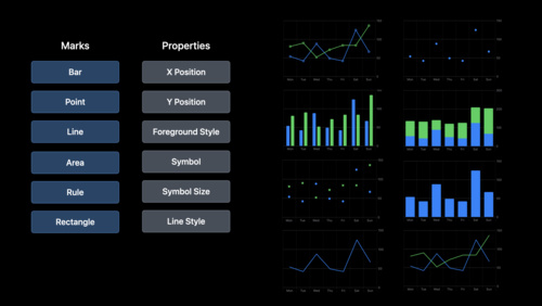
Swift Charts: Vectorized and function plots
The plot thickens! Learn how to render beautiful charts representing math functions and extensive datasets using function and vectorized plots in your app. Whether you’re looking to display functions common in aerodynamics, magnetism, and higher order field theory, or create large interactive heat maps, Swift Charts has you covered.
Watch at developer.apple.com ↗Chapters
Code shown on screen · 14 snippets
Histogram that shows distribution of capacity density
Chart {
  ForEach(bins) { bin in
    BarMark(
      x: .value("Capacity density", bin.range),
      y: .value("Probability", bin.probability)
    )
  }
}
Visualize function with LinePlot
Chart {
  LinePlot(
    x: "Capacity density", y: "Probability"
  ) { x in // (Double) -> Double
    normalDistribution(
      x,
      mean: mean,
      standardDeviation: standardDeviation
    )
  }
}
Customize function plot with modifiers
Chart {
  LinePlot(
    x: "Capacity density", y: "Probability"
  ) { x in
    normalDistribution(x, ...)
  }
  .foregroundStyle(.gray
}
Visualize area under a curve with AreaPlot
Chart {
  AreaPlot(
    x: "Capacity density", y: "Probability"
  ) { x in
    normalDistribution(x, ...)
  }
  .foregroundStyle(.gray)
  .opacity(0.2)
}
Visualize area between curves with AreaPlot
Chart {
  AreaPlot(
    x: "x", yStart: "cos(x)", yEnd: "sin(x)"
  ) { x in
    (yStart: cos(x / 180 * .pi),
     yEnd: sin(x / 180 * .pi))
  }
}
Specify domain for function plots
Chart {
  AreaPlot(
    x: "x", yStart: "cos(x)", yEnd: "sin(x)"
  ) { x in
    (yStart: cos(x / 180 * .pi),
     yEnd: sin(x / 180 * .pi))
  }
}
.chartXScale(domain: -315...225)
.chartYScale(domain: -5...5)
Specify sampling domain for function plots
Chart {
  AreaPlot(
    x: "x", yStart: "cos(x)", yEnd: "sin(x)",
    domain: -135...45
  ) { x in
    (yStart: cos(x / 180 * .pi),
     yEnd: sin(x / 180 * .pi))
  }
}
.chartXScale(domain: -315...225)
.chartYScale(domain: -5...5)
Visualize parametric functions
Chart {
  LinePlot(
    x: "x", y: "y", t: "t", domain: -.pi ... .pi
  ) { t in
    let x = sqrt(2) * pow(sin(t), 3)
    let y = cos(t) * (2 - cos(t) - pow(cos(t), 2))
    return (x, y)
  }
}
.chartXScale(domain: -3...3)
.chartYScale(domain: -4...2)
Use Double.nan to represent no value
Chart {
  LinePlot(x: "x", y: "1 / x") { x in
    guard x != 0 else {
      return .nan
    }
    return 1 / x
  }
}
.chartXScale(domain: -10...10)
.chartYScale(domain: -10...10)
Highly customized Chart
Chart {
  ForEach(model.data) {
    if $0.capacityDensity > 0.0001 {
      RectangleMark(
        x: .value("Longitude", $0.x),
        y: .value("Latitude", $0.y)
      )
      .foregroundStyle(by: .value("Axis type", $0.axisType))
    } else {
      PointMark(
        x: .value("Longitude", $0.x),
        y: .value("Latitude", $0.y)
      )
      .opacity(0.5)
    }
  }
}
Homogeneously styled Chart
Chart {
  ForEach(model.data) {
    RectangleMark(
      x: .value("Longitude", $0.x),
      y: .value("Latitude", $0.y)
    )
    .foregroundStyle(by: .value("Axis type", $0.panelAxisType))
    .opacity($0.capacityDensity)
  }
}
Vectorized plot for homogeneously styled chart
Chart {
  RectanglePlot(
    model.data,
    x: .value("Longitude", \.x),
    y: .value("Latitude", \.y)
  )
  .foregroundStyle(by: .value("Axis type", \.panelAxisType))
  .opacity(\.capacityDensity)
}
Vectorized point plot API
Chart {
  PointPlot(
    model.data,
    x: .value("Longitude", \.x),
    y: .value("Latitude", \.y)
  )
}
Vectorized plot modifiers
Chart {
  PointPlot(
    model.data,
    x: .value("Longitude", \.x),
    y: .value("Latitude", \.y)
  )
  .symbolSize(by: .value("Capacity", \.capacity))
  .foregroundStyle(
    by: .value("Axis type", \.panelAxisType)
  )
}
Resources
Related sessions
-
 17 min
 -
 22 min
 -
 10 min